Vattenfall
Intermediary Portal
How a permissions project led me to challenge the product model behind Vattenfall’s intermediary portal
As I translated the business requirements into a product model and tested it with intermediaries, I learned that the most useful way to organise permissions wasn’t around Vattenfall’s underlying structure, but around the customers intermediaries worked for.
That insight improved the permissions solution itself, and exposed a bigger problem with the product model behind the intermediary portal.
My contribution
Complex product modelling
I translated detailed business and technical requirements for permissions into a product model and interaction flows that stakeholders and customers could understand and evaluate.
Product direction
I recognised that the research exposed a broader structural problem beyond my assignment and brought that insight to Product, Business Analysis and stakeholders to initiate a wider discussion about the intermediary experience.
Customer research
I used interviews and prototype validation to test not only whether the proposed interactions were understandable, but whether the underlying model matched how intermediaries actually thought about their work.
Product exploration
I translated the broader insight into a new direction for the intermediary dashboard, making an intermediary-specific product model tangible enough for Product and stakeholders to evaluate.
Act 1 — Designing permissions
Turning complex requirements into a product model
Intermediaries manage energy contracts on behalf of multiple customers. Vattenfall needed a way for customers to control what an intermediary was allowed to see and do on their behalf.
Behind that seemingly straightforward requirement was a complex permission model involving different actors, contracts, connections, levels of access and exceptions.
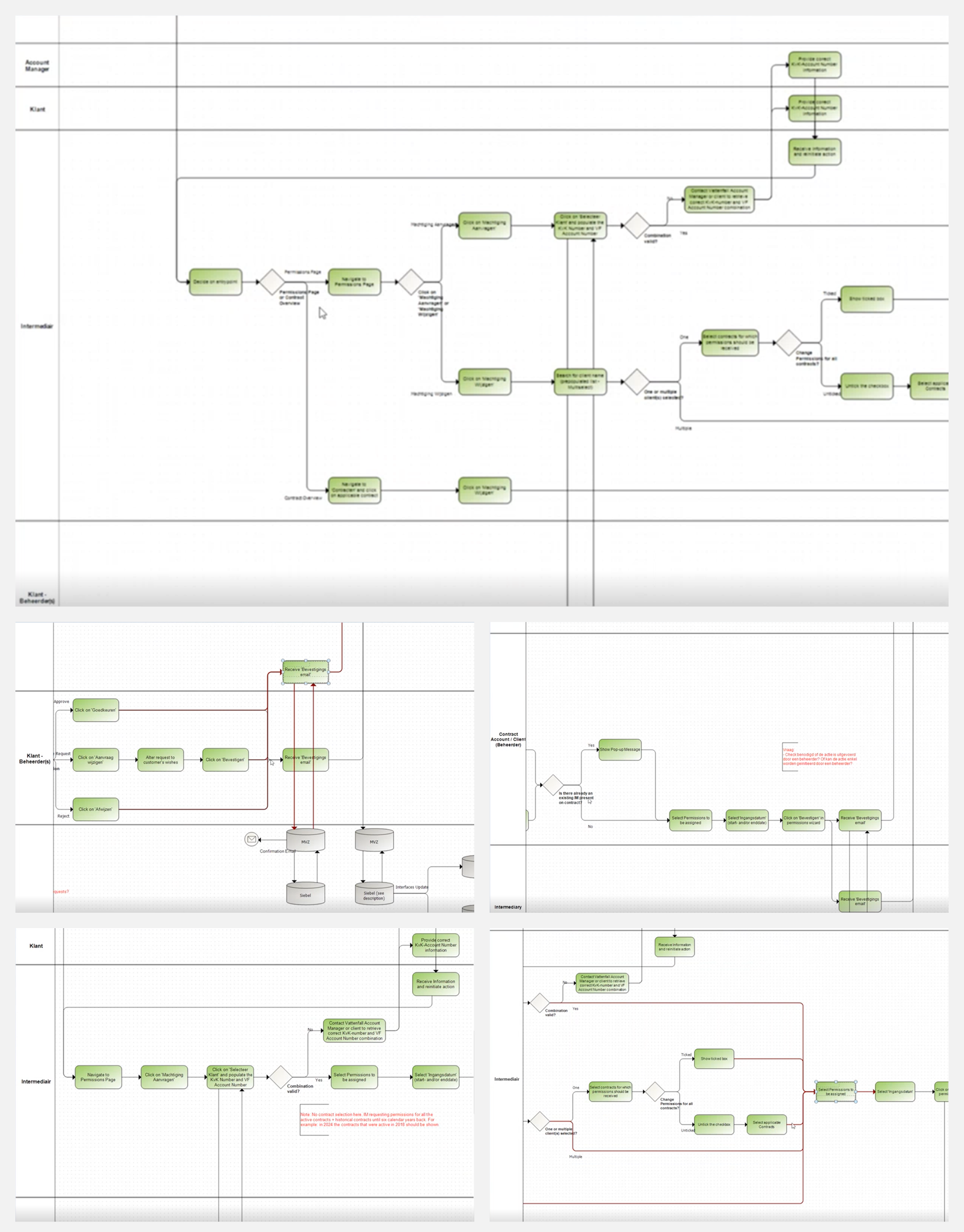
The original requirements mapped interactions between customers, intermediaries and different permission scenarios.
I translated those business and technical rules into visual flows and used them in stakeholder interviews to work through different scenarios, uncover missing requirements and build a shared understanding of how the model needed to behave.
This made an abstract set of rules concrete enough for Product, Business and Engineering to evaluate before we took the model to users.
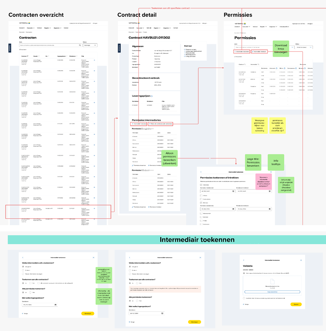
The original requirements mapped interactions between customers, intermediaries and different permission scenarios.
Testing the model with users
Once we had a coherent model, I set up research to understand whether it also made sense to the people who would actually use it.
The goal wasn’t simply to find usability issues. I wanted to test whether the way we had organised permissions matched how intermediaries thought about managing access for their customers.
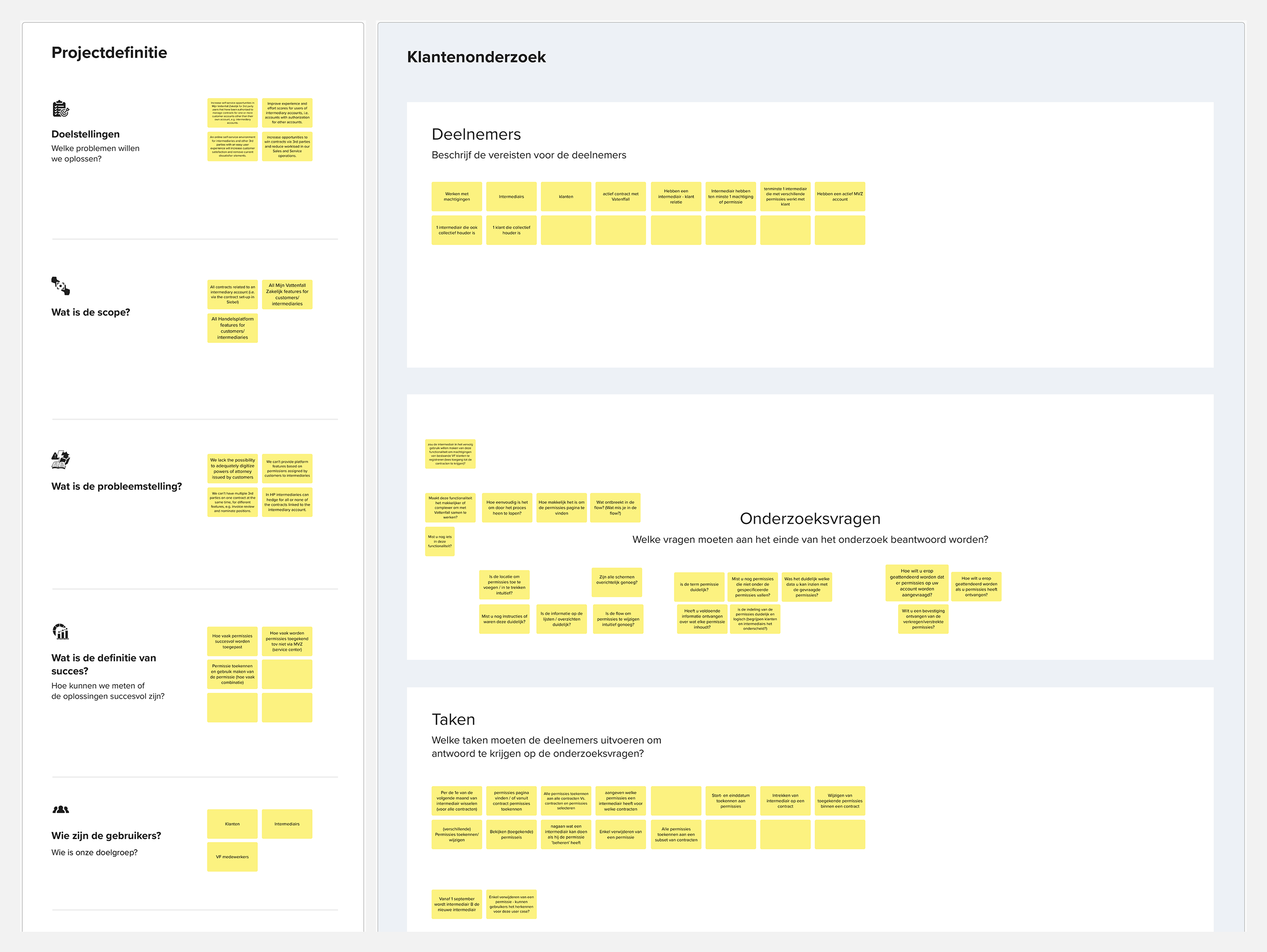
I structured the research around participant characteristics, research questions and realistic tasks to evaluate both the interaction and the assumptions behind the permission model.
Participants generally found the permissions overview understandable. But the research started exposing a different expectation about how the information should be organised.
One participant told us:
“Right now I see everything for all customers. It would make more sense to have everything in one overview per customer. I want to see everything for each customer.”
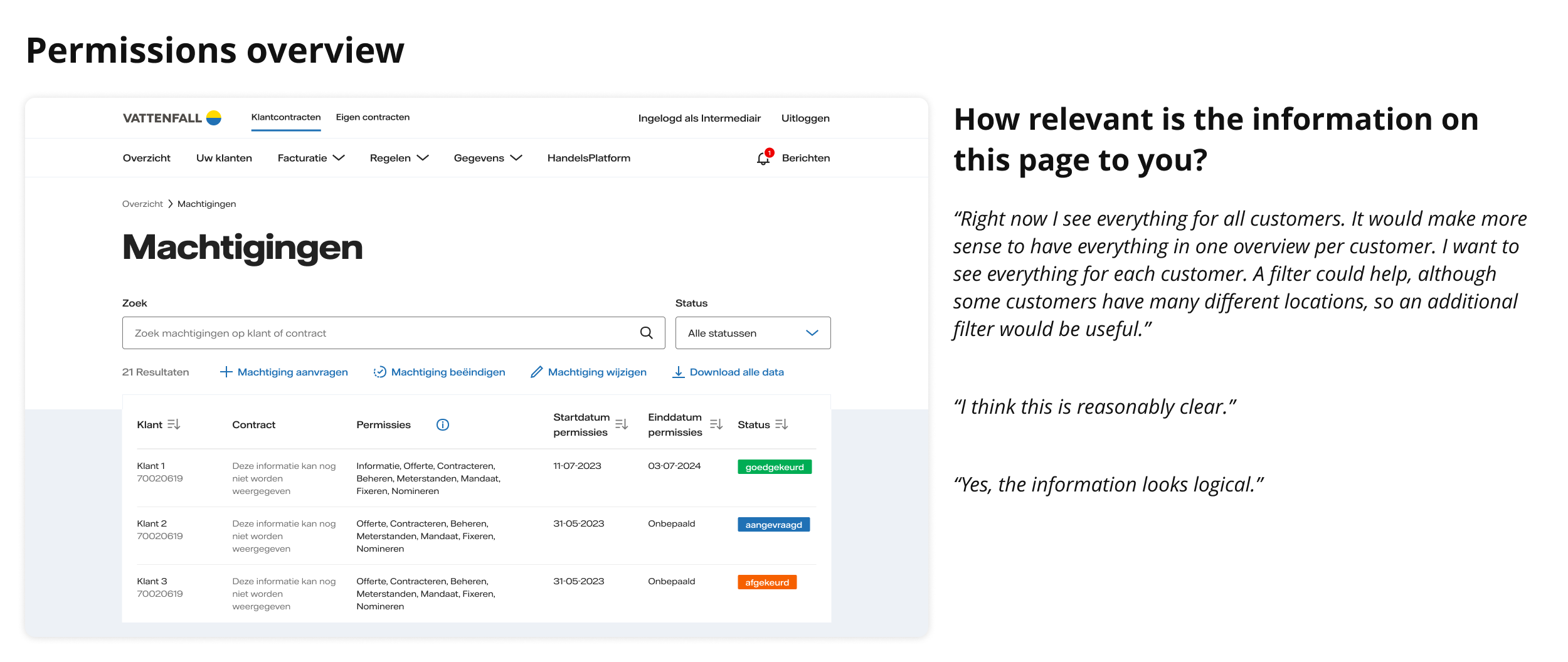
The contract and permission selection flow made that mismatch even clearer.
We had designed granular control over individual contracts and permissions. Intermediaries often described a much simpler default:
“You basically always want access to all contracts. Why wouldn’t you? I wouldn’t even want to be asked that question.”
Another participant described individual contract selection primarily as an exception:
“In principle, a request always applies to all of the customer’s contracts.”
The interface could support all the complexity in the requirements. The research showed that supporting complexity wasn’t the same as making that complexity the default experience.
Participants expected broad access within a customer relationship, with contract-level differences treated more as exceptions than the starting point.
Turning the research into a better permission model
The research gave us a clearer organising principle.
Rather than asking intermediaries to manage permissions through one overview spanning all customers and contracts, I moved permission management into the context of an individual client.
From there, intermediaries could see the client’s contracts and manage the permissions that applied to that relationship. Contract-level differences remained possible where necessary, but no longer defined the default experience.
The resulting model better reflected how intermediaries described their work:
start with the customer, then manage what you can do for them.
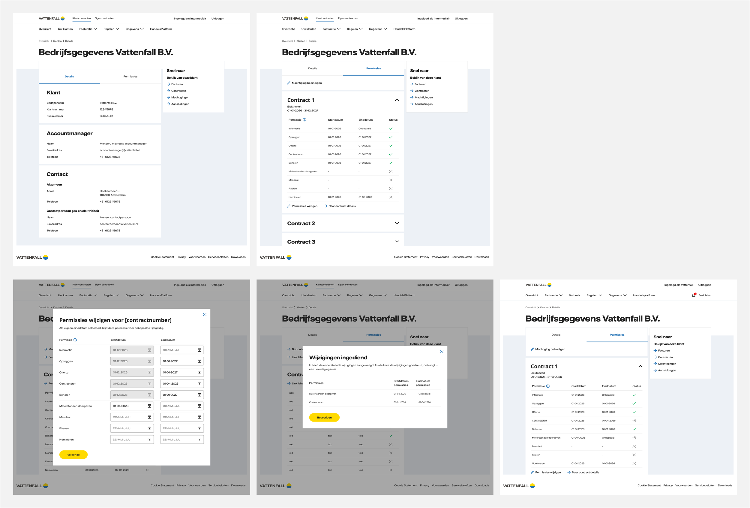
The revised design moved permission management into the context of an individual client while retaining contract-level flexibility where necessary.
Act 2 — Seeing the bigger problem
The feature exposed a bigger product problem
Solving the permissions problem around the client made me look differently at the rest of the intermediary experience.
The intermediary portal had been built on the same foundation as Vattenfall’s regular customer portal. Comparing their dashboards made the consequences of that inheritance visible.
The regular customer dashboard surfaced useful information about one customer’s relationship with Vattenfall: contracts, connections, outstanding amounts and energy usage.
The first intermediary dashboard largely retained that structure, but much of that customer-specific information had become generic navigation. It gave intermediaries access to different parts of the product, but little visibility into what was happening across their clients or what required their attention.
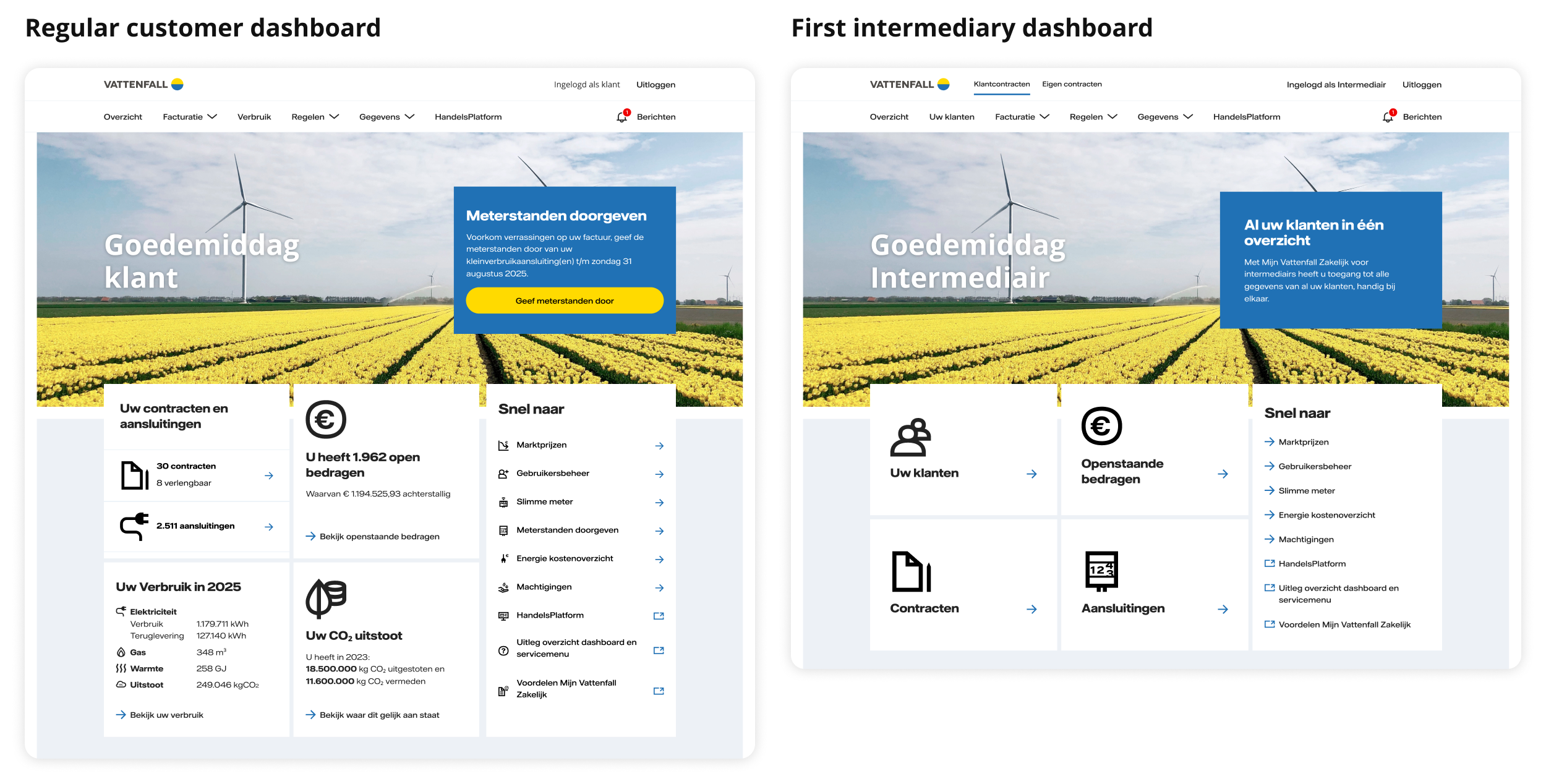
The intermediary dashboard inherited the regular customer structure, but much of the useful customer-specific information became generic navigation when applied to someone managing many clients.
The underlying problem wasn’t simply that the intermediary dashboard needed more information.
A regular customer manages one relationship with Vattenfall. An intermediary works across many clients, each with their own contracts, permissions, connections and ongoing activities.
We were adapting a product model designed around one customer for someone whose job was to work across many.
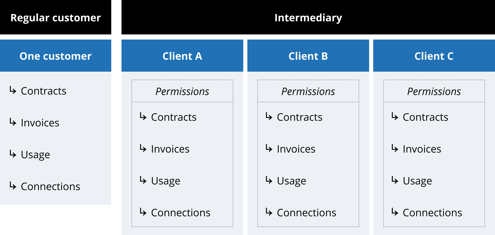
Same platform. Fundamentally different information needs.
Taking the insight beyond my assignment
Redesigning the intermediary portal wasn’t part of my original permissions assignment.
But the research had exposed a broader issue in the product, so I brought it into discussions with the Product Owner, Business Analyst and stakeholders.
Together, we stepped back from individual features and explored what the portal should prioritise if we treated intermediaries as a distinct type of user: what they needed to know, what required their attention and what they needed to act on across their clients.
The permissions project had become the starting point for a much larger product conversation.
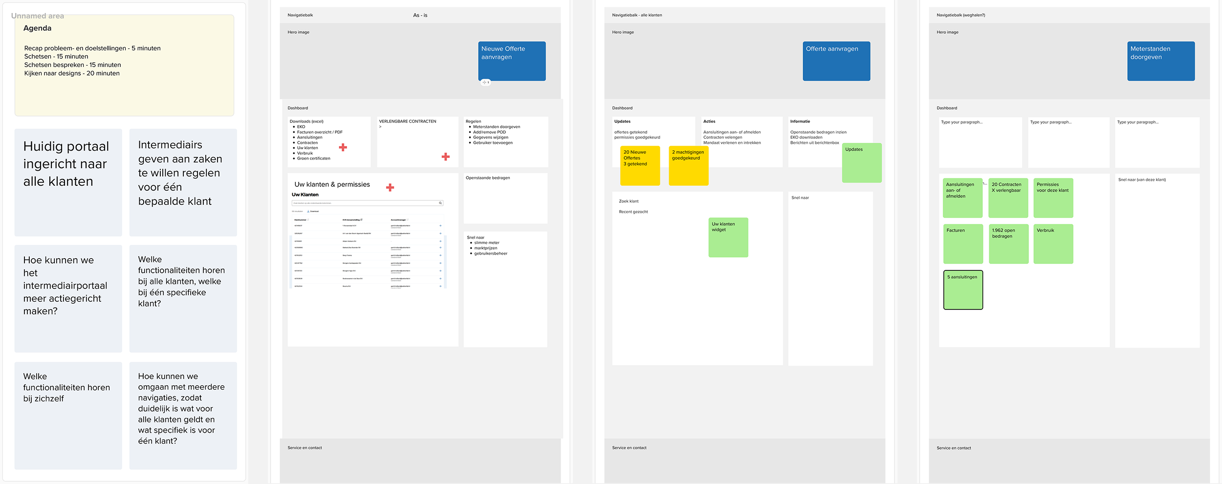
I brought the broader problem into a workshop with Product, Business Analysis and stakeholders to explore what an intermediary-specific dashboard should help users see and do.
Act 3 — Rethinking the intermediary experience
Rethinking the intermediary dashboard
I explored how the existing portal could better support intermediary work without simply reproducing the structure of the regular customer experience.
The direction focused on making the dashboard useful as a starting point: surfacing common tasks, making it easier to move between clients and providing more direct access to information intermediaries needed in their day-to-day work.
I used early concepts to explore how those needs could fit within the existing portal and make the new product direction tangible for Product and stakeholders.
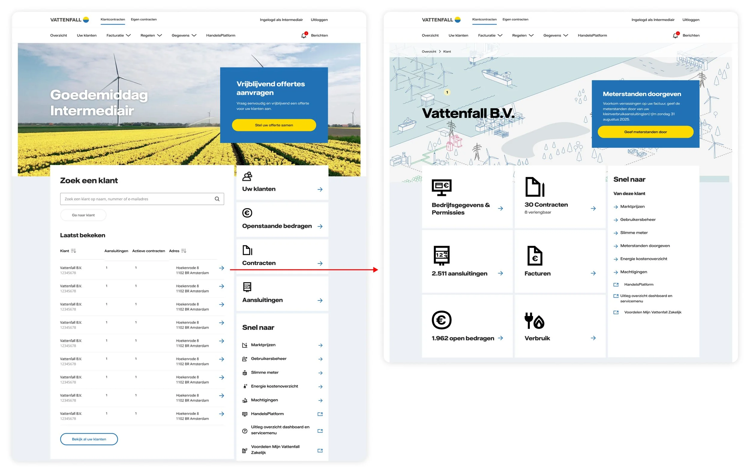
Early exploration of how the portal could evolve around intermediary workflows rather than primarily acting as navigation into product sections.
I developed that direction into a redesigned intermediary dashboard.
Frequently needed actions became directly accessible, while customer search and recently viewed clients supported the reality of moving between multiple customer relationships.
The value of the redesign wasn’t simply a different dashboard. It made an intermediary-specific product model concrete enough for the organisation to evaluate and continue developing.
What had begun as:
“How should intermediaries manage permissions?”
had become:
“How should Vattenfall support intermediaries as a distinct type of user?”
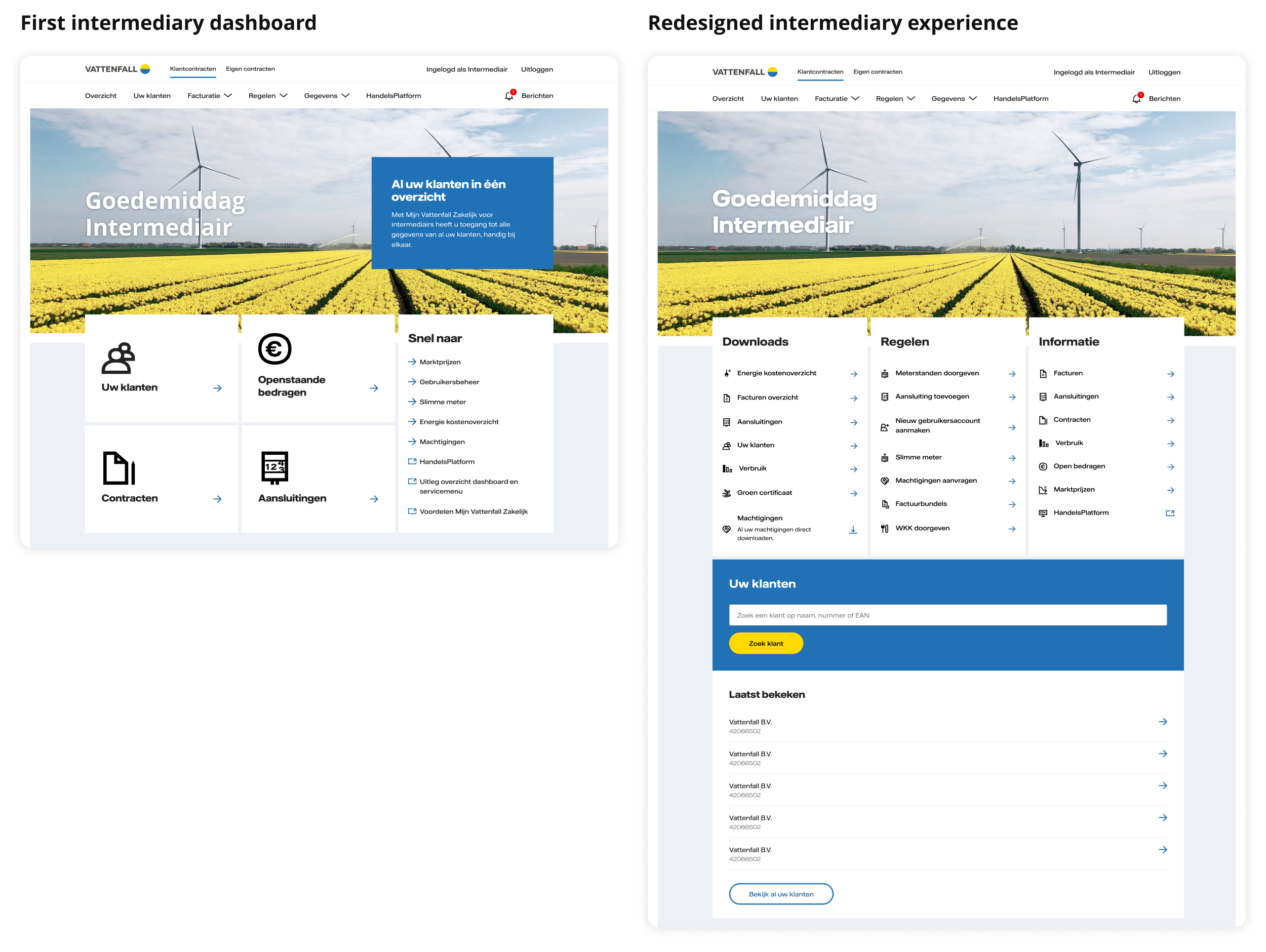
The redesigned dashboard shifted from generic navigation towards an intermediary-specific starting point, with direct access to common tasks and faster ways to move between clients.
Outcome
From improving permissions to reframing the intermediary experience
The work produced outcomes at two different levels.
At the feature level, research changed the permission model from a cross-customer overview to one organised around individual clients, while retaining flexibility for contract-level exceptions. That client-level model remained part of the intermediary portal after the dashboard was redesigned.
More broadly, the permissions work exposed a mismatch between the product structure inherited from the regular customer portal and the way intermediaries worked across multiple clients.
I brought that insight into the product conversation and helped turn it into a new direction for the intermediary dashboard — one focused more directly on common actions and moving between customer relationships.
I left Vattenfall before that broader direction could be fully developed, validated and measured, so I don’t attribute a shipped or quantitative outcome to the dashboard redesign itself.
What the work established was a different way of framing the product:
The intermediary experience shouldn’t simply be a variation of the regular customer portal. It needed to be designed around intermediary work in its own right.
Other case studies

ANWB Eropuit App
How I increased user satisfaction by optimising the performance of new and existing features in the ANWB Eropuit app.
Client: ANWB
Methods: User survey, competitor analysis, analytics based iterations.

LeasePlan Partner Portal
How I led the UX design for a B2B2C portal, enabling brokers, dealers and franchisees to onboard new customers, configure vehicles and sell lease contracts to SME customers in 30+ countries.
Client: LeasePlan Digital
Methods: User interviews, card sorting analysis, wireframes and mockups, page flows, prototyping, usability testing, design sprint.

FedEx
Recipient Experience
How I improved the recipient experience for 2,2 million engaged users in the US market and other 41 countries by leading the UX design for the iOS and Android apps.
Client: FedEx
Methods: Heuristic evaluation, stakeholder interviews, prototyping and usability testing, visual design.

ANWB Design System
How I ensured design consistency through all ANWB apps by translating the new ANWB brand guidelines to mobile and creating a unified Design System based on Figma tokens.
Client: ANWB
Methods: Design System, rebranding strategy.

TNT Design Language
How I led the TNT Design System team, shaping and evolving the TNT design language across all platforms, and helping create a consistent user experience across all touch points.
Client: TNT
Methods: Design System, responsive design, atomic design, workshops.