FedEx recipient experience

This is a case study showing how I led the UX design for the iOS and Android apps, focusing on improving the recipient experience for 2,2 million engaged users in the US market and other 41 countries.
Overview
The mobile app team located in Amsterdam (actually, Hoofddorp) consisted of a Product Owner, UX designer (me!), iOS and Android developers and a tester. Our team followed an SAFe framework approach and collaborated with teams located in Memphis and Dallas on new feature development and overall improvements for the app.
Duration
This project took place between September 2018 and August 2020.
My responsibilities
Stakeholder management and workshops
I collaborated with teams located in Memphis and Dallas to understand the complex set of business requirements and define user needs.
Customer Insights & Validation
I led usability tests to gather user insights and to present the value of design quality to senior stakeholders and executive-level leadership based on user feedback.
Design Execution
I managed the end-to-end design process of the team, ensuring on-time, detailed, and polished deliverables. I collaborated with developers to outline specs and deliverables, and with the content team to establish short and relevant copy guidelines for small screens.
Experience Strategy & Vision
I took ownership of the Track&Trace and FedEx Delivery Manager® experiences for the European market. I established the overall product design quality standards and evangelised the ROI of investing in quality designs to improve performance and reduce development costs, increase user satisfaction, ease of use, adoption rates and trust in the brand.
Design System and external agencies
I partnered with external agencies and other UX designers to translate the FedEx brand guidelines to the mobile Design System.
The challenge
When I started working with the team in the US, I noticed that their approach was based on building and delivering new features in a very high speed, but without evaluating how they would impact the overall quality of the product and the user experience. This hypothesis was reflected in the bad reviews users were placing in the App Store and Google Play Store.
Most challenges I faced during my period at FedEx were related to this cultural difference, and I soon started to make changes in the way they evaluated their quality standards.


Some of the main screens of the recipient experience.
Heuristic evaluation and research
I did a heuristic evaluation of the main flows in the recipient experience, and used the outcome to raise the main usability issues.
After that, I collected input from a varied set of stakeholders, from the team responsible for the brand guidelines, and dived into and a complex set of business rules. Based on this research, I created a proposal for how these issues could be addressed by only making interface changes, which would keep the costs and scope low.
Below I show a few slides I created to present the concepts and value of the improvements to product managers and stakeholders.


Getting users involved
After I got some momentum inside the company and started proving how the overall product design quality standards impacted the ROI, I came to a point where the business was divided between accepting it or not, and if it was worth the efforts to take steps to change it, when they had never needed to do it in the past.
I created high fidelity prototypes based on the new designs and organised several usability test sessions, comparing the previous flows with the new proposals. These designs were then adjusted based on user feedback, resulting in a final design that ensures an optimal user experience while, at the same time, covering all business requirements and backend limitations.
Below I show a few slides with the outcome of a usability test session.


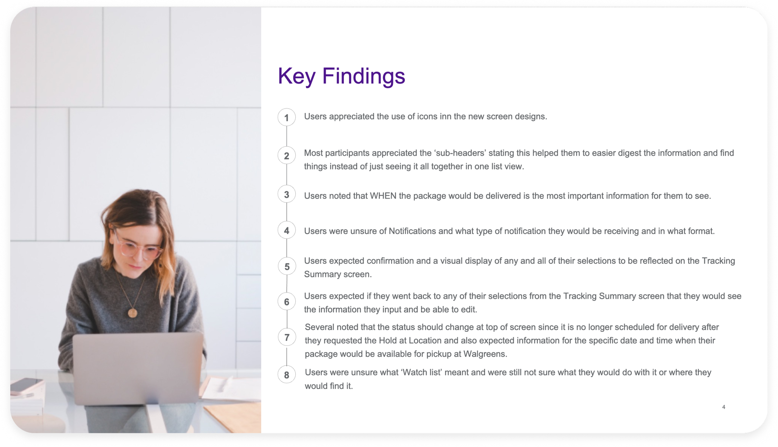


Outcomes
The most important outcome of my period at FedEx was the culture change I established. By leading usability tests to gather user insights and present the value of design quality to senior stakeholders and leadership, they started prioritising the overall quality of the product and the user experience compared with delivering new features in a very high speed.
Having listened to the end users and simply improving the product to match their needed, we managed to not only satisfy their wants, but also deliver more value to the business. From the UX standpoint, this was also a learning opportunity to work in a complex environment with many different teams and managers.
Case studies
ANWB My Account
How I increased product density through cross & upselling by leading the redesign of the My Account environment across the 3 main ANWB apps.
Client: ANWB
Methods: Task analysis, Lo-Fi and Hi-Fi wireframes, prototyping and user testing, visual design.

ANWB Eropuit App
How I increased user satisfaction by optimising the performance of new and existing features in the ANWB Eropuit app.
Client: ANWB
Methods: User survey, competitor analysis, analytics based iterations.

LeasePlan Partner Portal
How I led the UX design for a B2B2C portal, enabling brokers, dealers and franchisees to onboard new customers, configure vehicles and sell lease contracts to SME customers in 30+ countries.
Client: LeasePlan Digital
Methods: User interviews, card sorting analysis, wireframes and mockups, page flows, prototyping, usability testing, design sprint.

ANWB Design System
How I ensured design consistency through all ANWB apps by translating the new ANWB brand guidelines to mobile and creating a unified Design System based on Figma tokens.
Client: ANWB
Methods: Design System, rebranding strategy.

TNT Design Language
How I led the TNT Design System team, shaping and evolving the TNT design language across all platforms, and helping create a consistent user experience across all touch points.
Client: TNT
Methods: Design System, responsive design, atomic design, workshops.