
TNT Unified
Design System
Turning a fragmented product ecosystem into a shared design language
When I joined TNT, its digital products had evolved independently across web, mobile and desktop, creating increasing differences in both visual design and interaction patterns.
I led the TNT Unified Design Language team to understand where that fragmentation came from, determine which differences were necessary and systematically reduce those that weren’t.
The result was a shared design language, based on Atomic Design principles, supported by a Sketch component library and an online reference for designers and developers, creating a common foundation across TNT’s digital products.
My contribution
Design system direction
I led the assessment and definition of a shared design language across TNT’s web, mobile and desktop products, establishing what should become consistent and where platform-specific differences should remain.
Design System
I created and maintained a shared Sketch library that allowed designers across TNT to build products using the same components and patterns.
System rationalisation
I created an inventory of existing patterns and systematically reduced unnecessary variation across colour, typography, components and interaction patterns.
Design system adoption
I worked with designers and frontend developers through reviews, workshops and documentation to turn the design language into something teams could consistently use in their day-to-day work.
The challenge
Fragmentation had become part of the product
In only a few years, TNT’s digital products, including dotCOM, myTNT, Track & Trace and the mobile apps, had increasingly evolved in different directions.
The differences went beyond visual polish. Teams were making independent decisions about typography, colour, components and interaction patterns, creating inconsistencies for customers moving between TNT touchpoints.
There was also no central reference designers could use when creating new functionality. Developers had begun creating their own style guides and component libraries to fill the gap, introducing another layer of duplication.
The challenge wasn’t simply to make everything look the same.
We needed to understand where differences were justified, remove those that weren’t and create a shared language that both Design and Engineering could actually work with.

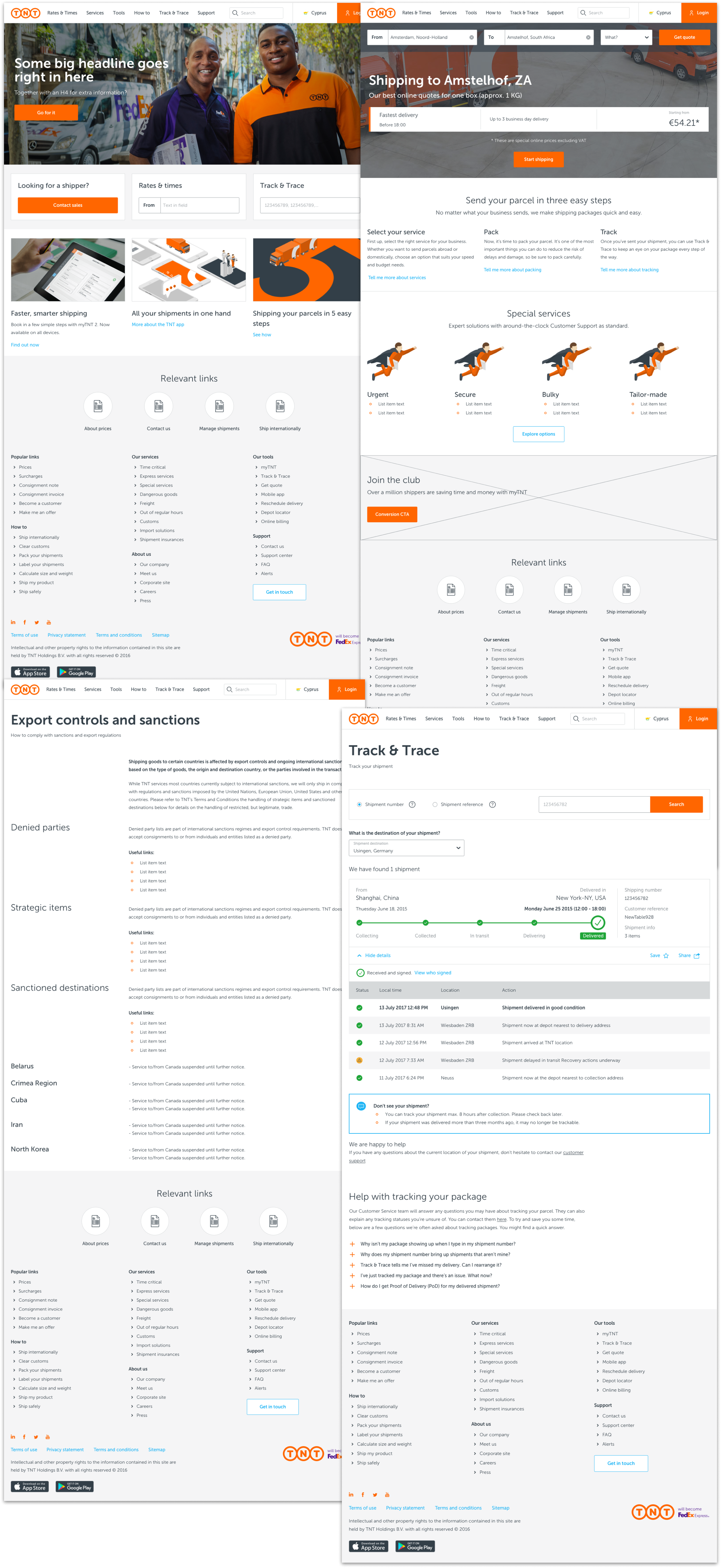
The TNT digital products - dotCOM, myTNT, Track&Trace and mobile apps - grew apart from each other in terms of interaction and visual design.
Turning inconsistency into something we could systematically solve
I started by creating an inventory of patterns across TNT’s major digital touchpoints.
The goal wasn’t to blindly standardise everything. Different platforms and contexts sometimes required different solutions, so I assessed where variation served a genuine product need and where it was simply the result of teams having evolved independently.
The scale of the fragmentation quickly became visible.
Across the products, I found 85 colours, 62 font sizes and 41 button styles, including variations of TNT’s primary brand colour that no longer matched the brand itself.
By mapping those differences, we could replace subjective discussions about consistency with concrete decisions about what the system actually needed.

Reducing complexity without removing useful differences
The inventory gave us a basis for simplifying the system.
We reduced the colour palette from 85 colours to 17 and typography from 62 font sizes to nine, creating a clearer hierarchy and a much more intentional visual language.
The 41 existing button styles became six, removing unnecessary variations while preserving the patterns needed across different products and contexts.
This wasn’t standardisation for its own sake. Every reduction meant fewer arbitrary decisions for designers, fewer variations for developers to implement and a more predictable experience for customers.
Turning the decisions into a reusable system
Once we understood what needed to become consistent, I translated those decisions into a system teams could actually design with.
We used Atomic Design as a practical way to break the existing interfaces down into their underlying elements and progressively rebuild them into reusable components and patterns.
The system established shared foundations for colour, typography, controls and interaction behaviour while still allowing products to accommodate genuine platform and contextual differences.


Putting the system directly into designers’ workflow
Documentation alone wouldn’t solve the fragmentation if every designer still had to recreate the system themselves.
I created and maintained a shared Sketch UI kit containing the components and patterns we had defined.
Designers could use the library directly when creating new functionality, making the shared language part of their everyday workflow rather than something they had to remember or look up after making design decisions.
The library also gave us a central place to evolve the system. New decisions could become reusable building blocks instead of remaining isolated within individual products.

Creating a shared reference for Design and Engineering
The system also needed to bridge the gap between what designers created and what developers implemented.
Working with a frontend developer, I created an online platform documenting the visual foundations, components and interaction patterns.
Alongside design guidance, it provided implementation information and code snippets so developers could work from the same definitions as designers.
This turned the design language from a collection of design assets into a shared reference across disciplines.
Helping teams adopt the language
A shared library and documentation could reduce ambiguity, but adoption still depended on the people using them.
I ran design-system workshops and regular design reviews with teams, using them both to improve consistency and to understand where the system itself still needed to evolve.
Rather than treating the guidelines as fixed rules enforced from a central team, the reviews created a feedback loop between the system and the products using it.
That helped us scale the design language while continuing to accommodate legitimate needs from different products and platforms.
Outcomes
From hundreds of variations to one shared product language
The TNT Unified Design Language gave designers and developers a common foundation across products that had previously evolved independently.
We reduced 85 colours to 17, 62 font sizes to nine and 41 button styles to six, replacing accidental variation with a smaller set of intentional design decisions.
The shared Sketch library made those decisions directly reusable by designers, while the online guidelines gave Design and Engineering a common reference for components, patterns and implementation.
More importantly, the work established a way to manage consistency across a complex product ecosystem without assuming that every product and platform needed to be identical.
Instead of repeatedly solving the same design problems within individual teams, TNT had a shared language that could evolve as the products evolved.
Case studies
ANWB My Account
How I increased product density through cross & upselling by leading the redesign of the My Account environment across the 3 main ANWB apps.
Client: ANWB
Methods: Task analysis, Lo-Fi and Hi-Fi wireframes, prototyping and user testing, visual design.

ANWB Eropuit App
How I increased user satisfaction by optimising the performance of new and existing features in the ANWB Eropuit app.
Client: ANWB
Methods: User survey, competitor analysis, analytics based iterations.

LeasePlan Partner Portal
How I led the UX design for a B2B2C portal, enabling brokers, dealers and franchisees to onboard new customers, configure vehicles and sell lease contracts to SME customers in 30+ countries.
Client: LeasePlan Digital
Methods: User interviews, card sorting analysis, wireframes and mockups, page flows, prototyping, usability testing, design sprint.

FedEx
Recipient Experience
How I improved the recipient experience for 2,2 million engaged users in the US market and other 41 countries by leading the UX design for the iOS and Android apps.
Client: FedEx
Methods: Heuristic evaluation, stakeholder interviews, prototyping and usability testing, visual design.

ANWB Design System
How I ensured design consistency through all ANWB apps by translating the new ANWB brand guidelines to mobile and creating a unified Design System based on Figma tokens.
Client: ANWB
Methods: Design System, rebranding strategy.