ANWB My Account
This is a case study showing how I increased product density through cross & upselling by leading the redesign of the My Account environment across the 3 main ANWB mobile apps.
My responsibilities
Customer Insights & Ideation
I partnered with project managers and designers of the other 2 app teams to uncover insights and translate concepts into features that address customer behaviours and motivations.
Planning & Scope Definition
I defined the product with my project manager partners. I evangelised customer goals and balanced business goals. I prioritised and negotiated features for launch and beyond.
Design Execution & Validation
I managed the end-to-end design process of the team, working alongside with developers and product managers throughout the development lifecycle and ensuring on-time, detailed, and polished deliverables to better adapt Android and iOS devices.
Experience Strategy & Vision
I created frameworks and presentations to share the vision, design principles and content strategy. This helped to evangelise ideas, gain alignment and drive decision making.
Validation
I managed usability testing in preparation for redesign. I defined testing parameters and script, created prototypes, facilitated test and reported results.
Leadership
I designed up and presented works to gain buy‐in from executives and senior stakeholders throughout the project lifecycle.
The challenge
The main business goal was to increase product density through cross & upselling in My Account. The challenge was to redesign the My Account environment, allowing ANWB members to find the products and services they have purchased effortlessly, and get inspired to purchase new services or upgrade the ones they have.
Research to identify user problems
I began doing a task analysis based on the current My ANWB environment and asking users what overall tasks they are trying to accomplish or how they currently accomplish the task. My goal was to understand user behaviours, needs, and motivations.
The main tasks they were trying to accomplish were:
get administrative information about their membership
get information about the products and services they have purchased, like the coverage of their insurance
upgrade or change a service
find previously purchased products
find created and saved content
The biggest pain points users were facing in the current My ANWB were:
the list was too functional and not very inspiring
it was difficult to find the information they were looking for
the products and services screen contained too much information and had no visual hierarchy, increasing the cognitieve load
too many accordions making it difficult to use
Not clear where to go to upgrade a service
options were not based on user profile

Vision statement
In order to define what the product should provide, I organised a collaborative workshop session where key stakeholders and team members aligned on a shared future-state vision.
To be a personal guide, standing by your side every step of the way.
✴︎
To be a personal guide, standing by your side every step of the way. ✴︎
Wireframes
I created Low-Fi wireframes in order to align ideas with the UX designers of the other 2 app teams and quickly gather feedback during our weekly critique meetings. The goal was to combine the business goals with user needs, and solve the user problems identified before, and come up with a user-centered solution that would fit all 3 apps.

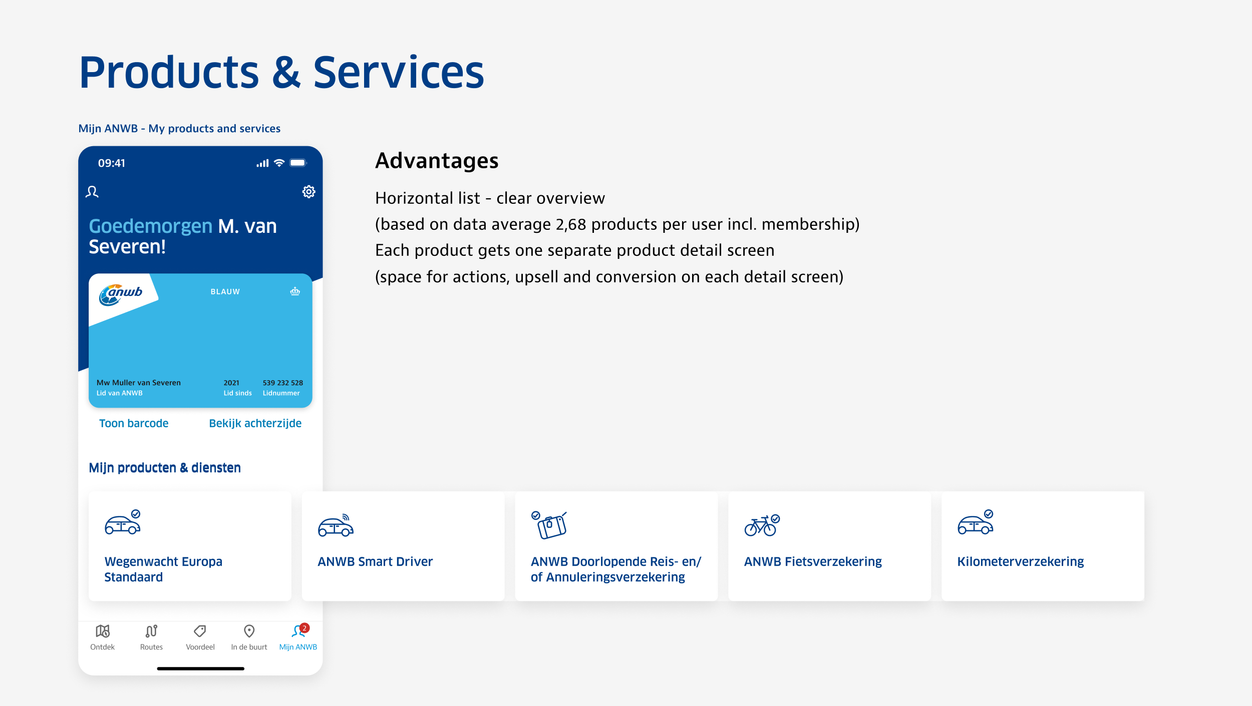
Example of Low-Fi wireframes used to define content order and hierarchy.
Visual mockups
I went from wireframes and low fidelity designs to visual mockups that I could use to validate the solution with product managers and stakeholders.


Slides I created to present the vision to product managers and stakeholders.
Validations
After getting all teams and disciplines on board with the ideas and solutions, I created a high fidelity prototype in Figma. In collaboration with the UX research team, I managed a guerrilla research at the ANWB store in The Hague. I defined testing parameters, questions and script, created prototypes, interviewed customers and reported results throughout the company.


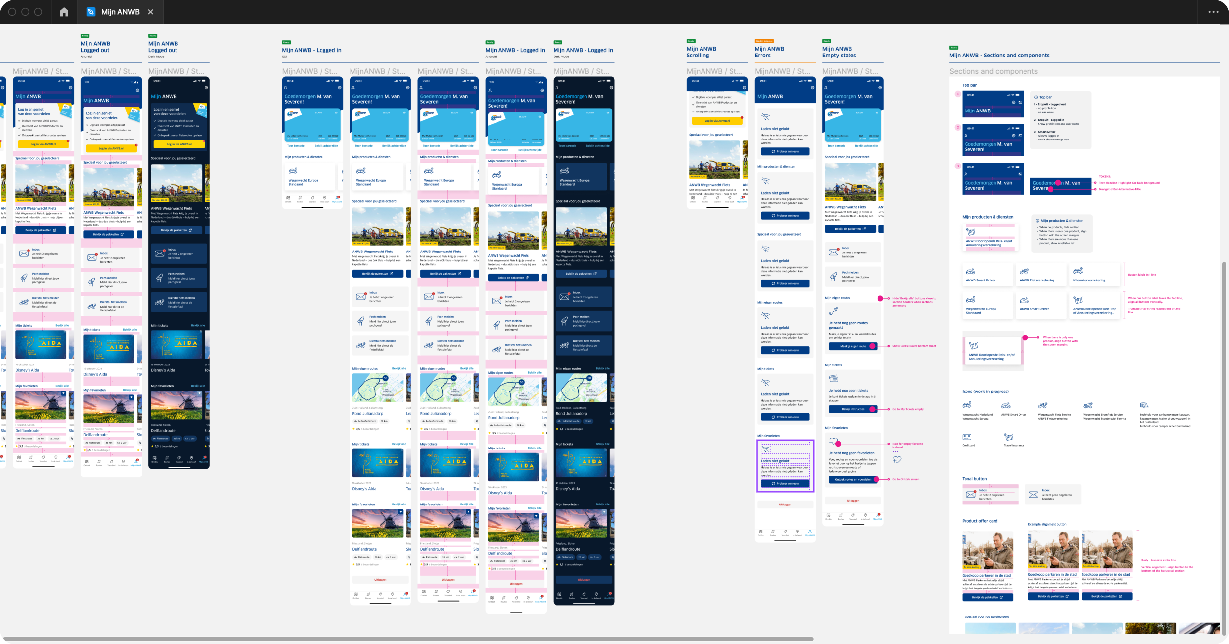
Detailed design and specs
Based on the findings from both UX research and validation sessions, we were able to come up with a list of changes that were addressed and updated in the prototype.
I created the documentations needed to communicate requirements to the development team and support quality assurance in writing test cases and measurement plans.
Part of this step was creating and adding the missing components to the Figma design system in collaboration with the UX designers of the other app teams, and aligning with the web teams to ensure consistency throughout all ANWB touch points.
Outcomes
Unfortunately, my contract ended before we could capture analytics based results after the go-live date. The points I would like to have validated to confirm my hypothesis are: - Increase in cross & upselling, purchase of new services and upgrade of existing services for new and existing customers, and the total revenue raised.
User satisfaction and relationship with members, by running new surveys validating how the vision statement is perceived and if the pain points were really improved, and identify opportunities to further improvements.
If the monthly active users and user retention rate have increased
The impact on login numbers
Furthermore, having listened to the end users and simply giving them what they truly needed, we managed to not only satisfy their wants, but also deliver enough value to the business. From the UX standpoint, this was also a learning opportunity to deliver great solution within limiting constrains across multiple teams and different stakeholders.
Other case studies

ANWB Eropuit App
How I increased user satisfaction by optimising the performance of new and existing features in the ANWB Eropuit app.
Client: ANWB
Methods: User survey, competitor analysis, analytics based iterations.

LeasePlan Partner Portal
How I led the UX design for a B2B2C portal, enabling brokers, dealers and franchisees to onboard new customers, configure vehicles and sell lease contracts to SME customers in 30+ countries.
Client: LeasePlan Digital
Methods: User interviews, card sorting analysis, wireframes and mockups, page flows, prototyping, usability testing, design sprint.

FedEx
Recipient Experience
How I improved the recipient experience for 2,2 million engaged users in the US market and other 41 countries by leading the UX design for the iOS and Android apps.
Client: FedEx
Methods: Heuristic evaluation, stakeholder interviews, prototyping and usability testing, visual design.

ANWB Design System
How I ensured design consistency through all ANWB apps by translating the new ANWB brand guidelines to mobile and creating a unified Design System based on Figma tokens.
Client: ANWB
Methods: Design System, rebranding strategy.

TNT Design Language
How I led the TNT Design System team, shaping and evolving the TNT design language across all platforms, and helping create a consistent user experience across all touch points.
Client: TNT
Methods: Design System, responsive design, atomic design, workshops.